Monday, April 9, 2007

Heads Rembrandt, Tails Lievens


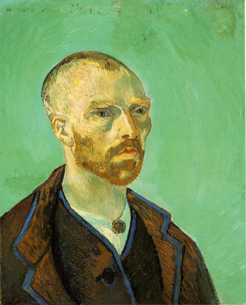
Art. I generally have no passion for the traditional sense of the word. When a monkey can take a paint brush, make a few lines on a canvas and sell it for thousands of dollars, I just have to question the whole movement. However, there is one style of art that I really enjoy and one artist that really strikes me as having some serious skill. Rembrandt. The guy could paint and the Dutch Golden Age of the 17th century is really something.

There are many critics, both adoring and critical, of Rembrandt’s work. Naturally, as one of the world’s most revered artists, an opinion of every kind will be had with respect to his work. One area of debate concerns the level to which Rembrandt collaborated with his contemporary, Jan Lievens. Because of the infancy of historical documenting methods during the day, truly knowing the level to which Rembrandt collaborated with Lievens will probably never be known, nevertheless, a number of art scholars have debated the issue.

Within art history circles, there is a developing belief that a number of drawings attributed to Rembrandt were actually drawn by Lievens. Roelof van Straten argues that at least two paintings attributed to Rembrandt (Circumcision, Rest on the Flight into Egypt) were actually painted by Lievens. He also argues that Rembrandt didn’t even begin making prints, as these two drawings are, until 1628, until at least three years after these drawings were created. In his essay, Straten does acknowledge that the two artists were trained in similar styles in relative close proximity, leading one to believe that the similarities between each painter’s creations are a result of this training, however, he notes that the similarities in style between many of Lievens’ drawings and the two mentioned earlier are so similar that there is little chance that Lievens did not draw them. He references the cross-hatchings in the clothing and the tilting of heads as important similarities. Straten sums up his argument by saying “there is no reason to believe that the styles of Rembrandt and Lievens were so close that their hands could possibly be confused” meaning that each artist has certain idiosyncrasies that even a similar stylistic training would overrule.

Straten also addresses the fact that Rembrandt’s name was etched on a number of paintings that he considers someone else’s. He notes that at least once, Rembrandt’s name was misspelled causing one to ask: Why would Rembrandt misspell his own name? He also notes that throughout Rembrandt’s career, dealers/artists would place Rembrandt’s name on their paintings in order to make money off of his fame. Also, the name of a buyer visited by Lievens (historically documented) finds itself on a questionable painting. Straten concludes that Lievens initially took his painting to Berendrecht, was initially rejected, but later the dealer Berendrecht in Haarlem retained the printing plate for the piece, and began printing the piece with Rembrandt’s name on it to cash in on Rembrandt’s fame.

While it is becoming more accepted that some of the drawings attributed to Rembrandt are Lievens’, there is still insufficient evidence to definitively say who really drew them. While Schatborn’s article does agree with Straten’s on some accounts, it is not a full endorsement of Straten’s “evidence” by any means. The thesis is hard to find in this article, but it can be summed up by saying that the evidence does not conclusively attribute Rembrandt’s drawings as Lievens’.

Schatborn relies on the training of the two men to explain why each could have drawn so similarly that the drawings attributed to Rembrandt could actually be his. Because each was closely trained under Amsterdam artist Pieter Lastman, there would have been elements of both artists’ work that would look the same, especially in their earlier drawings when their own idiosyncrasies would not yet have matured. The drawings in question are those of the artists’ earlier careers, so questions will arise more often here than in their later works. Schatborn’s main evidence is in this time difference, in that even though later works by Lievens and Rembrandt resemble one another, certain stylistic differences are apparent. But because these earlier style differences were not obvious, it is hard to assume that the attributed Rembrandt drawings are Lievens’.

Personally, I believe that the argument attributing some of Lievens’ drawings to Rembrandt is entirely possible, if not probable. Both articles reference the fact that art historians are increasingly suspicious of the early Rembrandt drawings and that they are probably Lievens’. Also, the ability for these critics and historians to accurately pick out small peculiarities between each man makes me believe that they know what they are saying. Although the evidence is not conclusive; I think the argument is a strong one, considering the practice of printers to put Rembrandt’s name on works that were not his in order to sell them.

Roelof van Straten. “Rembrandt’s ‘Earliest Prints’ Reconsidered.” Artibus et Historiae. Vol. 23, No. 45 (2002), pp. 167-177.

Schatborn, Peter. “Notes on Early Rembrandt Drawings.”
Master Drawings. Vol. 27, No. 2, Rembrandt Harmensz. Van Rijn 1606-1669: Papers Delivered at the Rembrandt Symposium at the Museum Boymans-van Beuningen, Rotterrdam, 19 November 1988 (Summer, 1989), pp. 118-127

Double Identities, Who Are We?

It is habitual for people to stereotype people based on characteristics and ideas associated with race. Some stereotypes label people in ways that lead them to think that something is wrong with the way they are; when it turns out that is not the case at all. Some misconceptions include the thought that Asians are smart in mathematics and can play the piano well. Alternatively, that African Americans love chicken and collard greens and need to be watched closely when they enter into a store. These stereotypes have developed in western society over several years of fallacies. No matter what background, people label someone who looks different from them based on what they have been taught by ones parent or by society in general. Sometimes, the labels that are associated with different categories of people create a sense of double consciousness, for both African Americans and women.


African Americans’ sense of selfhood has always been dominated by the white “gaze.” This mainstream has long been dominated by the western culture leading minorities to think that their only way of being was “incoherent and fractured.” The fact that people are aware of how others view and judge them causes them to view themselves in an entirely different way. According to feminist and postmodern artist Emma Amos, in the same way people are able to make judgments of through a visual, people can make connections and interpret the different stereotypes of race through art. It is easy to determine that art has long been marginalized for male artists. In Emma Amos works, she fixes herself to identify with not only the offended of her culture but that of women as well. Being able to look at herself through someone else’s eyes shows her the racism that has been excluding both blacks and women. As a feminist, she sardonically criticizes the norm by saying that she wants to be a white male artist. However, Amos refuses to accept that art is painted in the medium of a white, male perspective claiming that gender differences in art also need to be acknowledged. Women, she argues has been under the shadow of the male gaze for too long and should viewed as an equal to men in any area.


Involved in politics of culture and feminism, Emma Amos challenges her audiences to think about how these ideas about race, sex and identity are “constructed and disseminated through images.” While art has normally been gendered around a white male perspective, Amos chooses to paint of historical and political ideas that focus around both race and gender. Whether it is etching, monoprints, silk collagrpahs, photography or painting in general, Amos paints of opportunity for women and blacks. In one particular piece tightrope, Amos easily shows how someone tries to balance himself or herself in a demanding society biased upon women and people of color. The American flag leotard shows the woman confidently overcoming all of the demands and negativity associated with her being herself.


However, aside from the creativity of showing the humorous, playful possibility of a double identity, one argues that Amos has failed to realize the dangerous consequences of loosing one’s self in impersonation of art as foreseen by Du Bois. He acknowledges that the two-ness of being American and a Negro does little to contradict the fallacies that have been known to define race. Not only is it a misrepresentation of the truth, but it also leads to internal conflict for African Americans. During the first wave feminist, impersonation was only used to exploit the results of conforming. These false interpretations of different cultures result in a negative outcome for these people in what W.E.B. Du Bois terms as double consciousness. Dividing someone’s identity into several aspects as with stereotypes may cause people to try to conform or change their identity to fit the likings of others. Although the warnings perceived by Du Bois were silenced by the creativity of Amos’ work, some continue to say that the “two-ness” forms of impersonation and identity still punish those who are unsure of their well-beings in society.


Although Du Bois calls for black people to create their own definition of their culture, Emma Amos has found a way to cleverly make Du Bois’ fear of conforming to identity less serious while at the same time realizing that identities in her work is important for herself as well as others. She has used her paintings to show cultural meaning accounts for the generations that have been biased of women and colored artists. Her arguments against the norm in aesthetics and society gives a more colorful look on the multiple views society can have for a person.

Emma Amos. 4 April 2007.
http://www.the-artists.org/ArtistView.cfm?id=EDD13C83%2D95FA%2DCC76%2DFF9F9EC3D7FD9C5A

Gupta, A. Houston. “Double Consciousness: Black Conceptual Art Since 1970.” Art
Papers v.29 no.4. July 2005. 4 April 2007. http://vnweb.hwwilsonweb.com/hww/results/results_fulltext_maincontentframe.jhtml:jsessionid=FSXMUJTKYKU2XQA3DILCFF4ADUNGMIV0
Patton, Sharon F. “Thinking Paint.” 4 April 2007.
http://www2kenyon.edu/ArtGallery/exhibitions/0001/amos/amos.htm
Percent for Art in NYC. 4 April 2007. Picture.
http://www.nyc.gov/html/dcla/html/panyc/amos.shtml
Titus, Catherine Wilcox. “The Perils and Pleasures of Double Consciousness: Strategies
of Impersonation in the Artwork of Emma Amos and Sherrie Levine.” Southeastern College Art Conference Review. 4 April 2007. http://vnweb.hwwilsonweb.com/hww/results/results_fulltext_maincontentframe.jhtml;jsessionid=GPY3HOFDVDUF1QA3DILSFGGADUNFMIV0

The "Stenographic Figure" is a stenographer... whodathunk?

Jackson Pollock’s Stenographic Figure is confusing. All you have to do is take one look at it. So it comes as no surprise to me that there has been ongoing debate about what is even portrayed in the painting let alone what the content may mean. Since the painting was unveiled in 1943 there have been so many theories about the number of figures, the position of the figures, the significance of all the numerical scribblings… pretty much there’s a controversy about anything there could be.

In the article “The Artist in the Analyst” from American Art, the author Sue Taylor, spends the first section detailing many of the arguments of the most prominent art critiques and how they’ve influenced one another. The first sentence of the second section is Taylor’s actual thesis where she details what she herself will be arguing and then how she’s going to refute the arguments of the more prominent and historically important art critiques that she is building on. The thesis reads thus: “Though Lanhorne's reading of Stenographic Figure remains problematic, I believe she is correct in asserting that the painting contains a pair of figures, male and female; I am also convinced that the numbers, letters, and other notations Pollock deploys across the surface of the canvas carry a greater significance than the merely visual interest Rubin ascribes to them.” After reading through the five pages of introductory material that essentially summarized all scholarly analysis of Stenographic Figure to date, I felt it would be helpful to actually put the author’s thesis in her own words. Taylor then launches into a long and in depth examination of two of Pollock’s works (Stenographic Figure and Male and Female) from a Jungian point of view. She quotes extensively from the notes and studies that his two psychoanalysts (both of whom were disciples of the Jungian philosophy) left of him, to show what she believes to be the correct reading of the symbols and shapes as a female stenographer and a man giving dictation. This compelling evidence from Pollock’s own life that she supplies in support of her argument makes it a believable interpretation of a painting that is otherwise one confused jumble of color, shape, and scribbles. (The “Jungian Philosophy,” by the way, believes in the collective unconscious of humanity and the extreme importance of both conscious and unconscious symbols). She also quotes from Pollock’s own scribblings on his influences and the art shows and museums that he was frequenting at the time to glean what she can from the themes and subject matter of the paintings that he was viewing. I enjoyed that Pollock was described as an “extremely inhibited patient” who was nearly impossible to work with and who hardly ever talked or helped the psychoanalyst. He created both paintings when he was just coming out of his years of being analyzed and had Jungian gobbledy-gook exploding out of his ears.
The interesting thing about the contradictory “article” that I’ve found to contrast with Taylor’s interpretations is that it directly references Taylor. It is actually in a section on “art history” one someone’s personal website which makes it a far from credible source given that the people who own and run the site are just your everyday bumpkin with a general interest in the subject, who happens to have taken one or two classes on art history. What is promising about their website is that it has an extensive bibliography to accompany their otherwise amateur articles giving the impression that perhaps they wrote these miniature essays for class. The argument given as to the interpretation of stenographic figure is a compelling one. Whoever on earth has written this article claims that to give a strict reading of Stenographic Figure according to a Jungian model would leave at issue the fact that many of the symbols in the painting were consciously created by Pollock. They claim that the true meaning behind the symbols in Pollock’s painting is that you cannot read too deeply into the symbols. Personally, I find this interpretation so witty that it’s easy to be won over by it, simply from the sheer brazenness attributed to Pollock by creating such an ambiguous painting and allowing art critiques to puzzle over it for decades. Sheer genius.

Van Gogh or van No?


Vincent van Gogh made an incredible splash on the art scene before he committed suicide at the age of 47, after spending 70 days with his esteemed friend, Paul Gachet. Van Gogh was a fantastic artist and is accredited with many works of art, yet a debate arises when certain pieces cannot be directly attributed to van Gogh himself and their provenance seems to be lost in the tussle of some museums’ desire to acquire his artwork. The family of Gachet is well-known to have sold pieces of artwork that were of questionable origin, since he himself and his son were aspiring artists who had a knack for imitating pieces. The debate about the origin of these paintings, though heated, has two sides. Both Per Hedström and Britta Nilsson, who wrote one article, and Michael Kimmelmann, who wrote another article, analyze what is to be done with van Gogh forgeries and if fakes have any artistic merit.


In the article by Hedström and Nilsson (Per Hedström and Britta Nilsson, “Genuine and False van Goghs in the Nationalmuseum” from Art Bulletin of Nationalmuseum Stockholm 7 98-101 2000), one painting in particular is questioned. “The Cornshocks,” of which there are two similar copies and therefore the question arose, is believed to have been forged as a van Gogh. Its copy in the Nationalmuseum is said to have been painting on a cardboard canvas using some cadmium yellow coloring. The article states that no other painting by van Gogh displayed these characteristics; therefore it had to have been a fake. Yet another clue points to forgery in that the other copy, that was in the Toledo Museum of Art in Ohio, was produced in Auvers in 1890. Auvers is the exact location of the Gachet residence and where the family could have reproduced the painting and claimed it as a van Gogh after his death. This article incorporated stylistic elements of the works to try to prove that one was a forgery. Some people have decided that the Nationalmuseum’s version is a sketch for the Toledo one. Both paintings were analyzed and the Nationalmuseum version was decidedly a forgery. The basic idea is that technology can disprove a painting to be a fake and therefore forgeries should not be on display.

In the New York Times article by Kimmelmann, the changing societal feelings about forgery are examined. With regards to van Gogh and the Gachets, forgery had, but that time, become almost criminal. Apparently the Gachets knew this, and acted very strange about the paintings they claimed were by van Gogh. They refused to lend them to exhibitions and were very reticent to let people see them. But instead of taking this odd behavior as a single that some paintings could be fraudulent, the article supposes that the paintings could have just been done van Gogh’s bad days, and therefore are sub par when compared to his other works. Kimmelmann also states that when the Gachets copied or imitated other works of art, they signed it with their own name or clearly labeled them with their pseudonyms, so as not to have any confusion with the real artists themselves. The article also provokes the idea that scandal about the artwork brings in more visitors, and thus more people are exposed to works of art, be it fake or not. The author implores us to consider looking at the painting for what it is, yet regrets that the authenticity is really what gives it value. The quality is not as important as if the artwork is really by van Gogh, or some other renowned artist. The argument is that we, as humans, need authenticity to stay in reality and have a hold on what is our real history.

Both articles analyze the artwork, or supposed artwork, of Vincent van Gogh in different lights. When forgery becomes an issue, it not only affects the viewer’s opinion about the artwork, but it also affects the psychology of the viewer. We value authenticity, especially with van Gogh paintings, not only for its monetary quality but also because it is the foundation of our history and marks when real events happen. If everything was a forgery, there would be no history.